The idea was to do a very short (perhaps as little as one minute long) animation on the nativity story for Christmas, with an offbeat theme. I liked the idea of giving donkeys some agency, so Mary's old donkey retires and presumably arranges for a replacement, a time-travelling taxi-driving donkey (from a future Donkey Civilization? who knows). Anyway, after some development of the story, I captured the gist in a mini storyboard.
Mini storyboard for Taxi for Mary
Process
I wanted to use felt shapes originally, but in the timescale I decided to use felt and other textures photographed and imported into Adobe Flash CS5. This is perhaps the last hurrah for my Creative Suite 5, since it will no longer work with the next version of MacOS. However, as the story was to be driven by the narration of the donkey-taxi-driver, I thought this character might be easier to animate as a sock-puppet, especially as it would be sitting behind the steering wheel all the time.
Visualization of donkey-driven taxi
I thought about a uniform or cap for the donkey, but that seemed too fiddly and unnecessary, so I looked for more naturalistic style.
Some visualisations of the donkey's head
I used an old sports sock, cutting two holes for little finger and thumb (for donkey's forelegs to operate steering wheel) and a large gap for the mouth. I covered the sock with felt and sponge padding (cut from an old seat filling), only receiving a few mild burns from my hot glue gun. Note to self: upgrade health and safety. The donkey's ears were wire loops at each end of a wire bent to include a neck support, covered in moulded wire mesh, masking tape and a top layer of felt. The idea was that the ears would be bent as if by the roof of the taxi cab. The forelegs were made as separate digit-mittens, with moulded black plasticine hooves with neodymium magnets embedded to (hopefully) contact with the metal steering wheel, made from a jar lid. The donkey's mouthparts had space at top for middle finger and below for the other two fingers so I could animate the mouth for rough lip-synching.
The steering wheel was stuck inside a frame built of LEGO®, clamped to sturdy laptop desk, placed in front of green card, and lit by three LED lights. The video camera was placed on a tripod and zoomed in to accommodate the frame. Then the donkey sock puppet was positioned with its hooves holding the wheel, and videoed lip-synching with the pre-recorded (in Apple GarageBand) narration.
Green-screen frame for the donkey puppet
The video was then taken in segments into Apple iMovie, synchronised manually to the audio output in segments from Garageband, and edited to length. Each video segment (still rotated 90° from upright) was then exported as QuickTime movies. To crop, rotate and remove the green backgrounds, the videos were then imported into Apple Motion. After cropping, rotating and resizing (to about 540 pixels square) the keyer filter was applied, which automatically detected the green colour, and then the right slider in the spill contrast had to be slid all the way to the left to fully remove the background. The video was then exported with the alpha (transparency) channel.
To get the video into Adobe Flash, it was first converted into FLV (Flash video format) by Adobe Media Encoder. Once in Flash, it was placed like any imported video without using a surround. The audio was retained in the imported video through these operations.
The rest of the work in Flash was relatively straightforward. Some simple effects were used, and mostly very simple shapes with imported textures as bitmap fills with minimal animation were created.
I wanted to finish up back at the start (Mary and Joseph's Carpentry in Nazareth) to illustrate that the original donkey had retired, not "retired", as might have been implied by the narrator, and indeed had been joined by her replacement. This is where a photograph of the puppet was broken up into slightly simplified Flash shapes, and a slightly smaller mirror copy was elderified into an old white donkey. This hopefully help tie up the different visual styles and produce an adequate ending to animation already about 2 minutes long.
Donkeys at rest visualisation
Result
Reflecting back, a major theme was time, probably not surprising considering how time-consuming animation can be, and in this case a looming deadline of Christmas Eve, which I met before tea-time when I uploaded the video and English captions. There were some weak gags and observations, and Mary was not simply a passenger either. While this project was essentially another animation test (and my first green-screen foray, thanks to a useful tip from the Internet), it also met my original concept and was completed on time (even if I had to buy Apple Motion, it was worth it).
Where might you use vector graphics in Open Educational Resources? What opportunities, best practices and constraints might you consider?
This post is intended as a quick but wide run-through of some collected thoughts on these questions. As before, the focus will be on building collections of reusable, interoperable components that can be easily combined and edited, reducing the development effort and increasing the quality of learning materials.
Use cases
Configurable objects
You may require a graphic that represents a particular state of an object. One example might be an analogue clock showing a particular time. If you had to edit the clock manually by rotating the hands, this is relatively inconvenient and even error-prone. It would be simpler to input the time into a component which would then render the clock displaying the required time.
Similar to animation are posable objects, which may have parts that can be transformed (rotated, scaled, skewed, translated and so on). Human figures may have rotatable limbs, for example, which could be handy if they were to hold a variety of objects.
Assessment multiple choice
A collection of shapes and symbols may be useful in multiple choice questions, and this is more powerful and flexible when these can be combined.
Where the position of objects relative to each other in a bounded space is significant, such as in the cases of floorplans, maps, archaeological digs, crime scenes, team sport formations and so on, vector graphics can be effective at promoting the significant parts and reducing visual clutter (especially in conjunction with labels and styling, possibly a key).
Scenes
In other cases, possibly elevations (side on) rather than plan (top down) views, vector graphics can illustrate actors and objects, such as institutional settings, theatrical stages or public spaces. One typical use is, in conjunction with a painted scene, a smaller visual key with numbered shapes and labels. Example: John Trumbull's Declaration of Independence. This effect can also be achieved interactively by an invisible layer (or area map) with vector shapes plus labels that pop up as roll-overs.
Using illustrations where photographs may be problematic or less effective
where actual photographs may be too dangerous (say, depiction of accidents) or upsetting (violence)
where photographs would identify individuals (in an unwanted or unwarranted sense)
where available photographs would not meet standards of balance or inclusion
illustrations could replace photographs of children or other protected groups
Internationalization
Graphical representations may be more internationally recognizable, although there are often conventions to learn (not all cultures use the same representations and symbols). In SVG, like other markup languages, you can specify different languages for text.
Editable graphics may be customized to different cultures.
Low bandwidth
Efficient vector graphics suit mobile (many devices have chips optimized to handle SVG), slow dial-up connections, and are generally more losslessly-compressable than bitmap images.
Infographics
Infographics make particularly good use of outlines.
Cartoon panels
Sequences of cartoon-style panels can efficiently and effectively demonstrate processes and actions in a familiar storyboard way.
Games
There are whole genres of games that have used vector graphics, and some references may be especially effective at reaching certain audiences.
Engagement and humour
Sometimes, illustrations can quickly draw the viewer in through an emotional connection, often with the simplest of shapes (hence the popularity of smileys or emoticons). Humour, such as the skillful juxtaposition of incongruous objects, can also be engaging, although subjective.
The kind of gentle humour of Richard Scarry's illustrations is geared towards a younger audience, but the same principles apply to a lot of educational illustration (his cut-away aeroplanes show how jet engines work, for example, but in this case the narrative is driven by characters, their actions and reactions).
Considerations
What not to include
It would not seem necessary or advisable to include:
symbols represented sufficiently as Unicode characters (although if more detail, variation or two or more foreground colours are needed, then inclusion may be reasonable)
symbols and graphical components that are commonplace in drawing applications like Visio
graphics which unduly duplicate others already in the library (bearing in mind that similiar variations should be able to be derived from a single source object)
particularly sensitive or provocative imagery (although some image libraries, such as graphic medical content, could be published in a restricted manner)
Scale normalization
The purpose of having some kind of normalization of scale is not so much for printing or displaying at (multipliers of) actual size, but for combining objects in a way that can (if desired) preserve their relative sizes. Not all images have actual sizes though, and some look similar at different sizes/magnifications (like fractals) or fall into a wide range (like icebergs or clouds).
In the locomotive example mentioned above, the graphic is scaled at 1/100th (a centimetre of the graphic equalling 1 metre in the physical world).
Collections
Collections could be created in various subjects from various disciplines, for example:
transport
people
occupations
roles
biology
taxonomy
processes
Organizing resources within collections makes it easier to spot (and fill) gaps, and run editorial and technical processes such as reviews and validations. It also makes it easier to pull graphic components into combined drawings with greater assurance that graphics from same collection (or sub-category thereof) would be interoperable.
As long as the objects were accessible over the Internet (indexable by search engines) and used consistent metadata schemes, collections would not need to be hosted in the same online location (website).
Here is some advice I received from the CETIS-metadata list:
If your graphics are embedding an HTML OER then I would mark up that resource using schema.org. I would try to markup the HTML around the SVG as a separate item without having to putting any schema.org markup into the SVG (i.e. if it is a figure with a caption, I would put it in its own <div> and mark up the caption as the description). Similarly if the graphic is presented in isolation, on an HTML with some info about it you could mark that up with schema.org.
This seems like it should work, and I have tested that attributes are readable to search engines by using the Google Structured Data Testing Tool to check that both RDFa and schema.org metadata are being picked up (in a HTML5 page with embedded SVG).
There are still some tricky areas (subject vocabularies for classifying collections, artistic style vocabularies to indicate stylistic compatibility).
Graphic style
it might be best to avoid drawing shadows (outlines on hidden layers could be transformed into shadows cast on the ground) or shaded parts of surfaces, since combining graphics could give jarring results
scope could be provided for using corporate colours to replace two or three main (default) colours
viewpoints will vary: elevation, plan, perspective, distorted (and sometimes you will want the set, typically for built objects with clearly-defined facings)
limited set of artistic styles
possibly a semi-realistic Ligne claire (clear, uniform lines; flat colour) style
non-essential backgrounds should probably not generally be included, but if included then minimal and easily detached/removed;
human figures may be drawn in a few standard perspectives to facilitate their combination within a setting.
Combination with bitmap (raster) images
Structured graphics can contain bitmap images and text as well as vector components.
textures
hybrid (such as combining satellite photography with vector-based roads and location symbols in online mapping tools)
Technical
CSS style naming conventions to avoid collisions or allow overrides (see corporate colours).
drawing to a grid to simplify measurements, animations and translations.
At some point, newer formats or versions of formats will appear (like SVG 2), and over time older versions may become less supported (Adobe Illustrator CS5 won't open FreeHand drawings before version 7, it seems). Some way of managing file format versions is generally required, and every graphic object should have a clear indication of the type and version (for example, SVG 1.1) which is available to the repository search function.
2D vectors from 3D possible, especially from CAD subjects.
SVG should work well with high resolution, small size ("Retina") screens and subpixel measurements.
Import and conversion
SVG cannot be imported directly into Microsoft Word or PowerPoint. It may be possible to open SVG in the free Inkscape and save as Windows EMF format, which can be imported into these Microsoft Office products, although there may be some aspects which do not directly cross over.
Further steps
It should be possible to generate 2D vector graphics from 3D models. Software tools such as Swift 3D already do this.
Existing collections could be prepared/converted.
Open invitation to art colleges and industry? Celebrity contributions?
The kind of open community of IAN where people can request and submit symbols may well be the most successful model for organic growth and matching contributions to need, given a critical mass of requesters and contributors with the requisite spread of subject knowledge and skills.
To the extent possible under law,
Sleeping Dog
has waived all copyright and related or neighboring rights to the text of
Considerations and use cases for an Open Educational Resource vector graphics library.
This work is published from:
United Kingdom.
For my next project, following in the great traditions of animators like Ray Harryhausen, I decided to animate in stop motion a familiar folk tale. It should ideally need only one set, moderate action, a manageably small set of characters, and be narratable in about two or (at a pinch) three minutes. The Norwegian folk tale of the Three Billy Goats Gruff was one of my favourites, and seemed practical. This post is the story of how I made this:
Research
I read some versions of the tale, and timed some narration. We don't seem to have trolls in Scotland, but we do have goats, and I wanted to get some video of them, to see how they moved, ate grass, butted each other and so on.
I phoned up Fife Animal Park to ask if they had any goats. Yes, they said. So on a cold March day I went by train and footpath, past swans swimming in icy lakes and along country roads, to the park, by which time it was snowing. It turned out that Fife Animal Park was a heaven for goats. Not only that, but while other animals were sheltering in their straw-filled dens, there were lots of goats running about, of various shapes/sizes/colours/ages, trying to cadge feed off hardy visitors. I took lots of useful reference video, which was particularly helpful as I couldn't easily find what I was looking for online (maybe I'll post some editing clips in future).
Storyboarding
The storyboarding was straightforward: one beginning panel, three panels (one for each) of the goat–troll encounters, and one ending panel.
Script
My first attempt at the script departed from the traditional with some asides and scene-setting, but when I timed it, it took over four minutes to read. That's a lot of still frames. I went back to quite a cut-down, traditional reading, without the more quirky (by modern day) or poetic parts. This was a much more realistic 2 minutes and 20 or so seconds.
Sound
Narrating the shorter script was easier on my voice, too. I recorded it in five separate files (one per scene) in Garageband using the Male Narrator track preset, using a Yeti USB microphone with pop shield. I found that the best voice I could produce was a relaxed, subdued story-telling rhythm, although I had to create four other voices for the three goats and the troll. I suppose I must have made funny faces while recording those, but we'll never know.
I didn't really do any sound editing apart from trimming to edit out non-speech time. However, I probably should have adjusted the amplitude upwards at the start of Scene 2, where it begins a bit quietly.
Materials
There were a lot of different materials used in the making of sets, models and props. I sourced some locally, some online. I'll cover these in the following sections.
Tools
I read that a hot glue gun would be useful, and turned out to be particularly handy for covering large areas quickly, like sticking stones to board, or grass card to papery hills. And the usual: scissors, rule, needle, pliers, hobby vice, model holder with crocodile grips and magnifying glass, paintbrush, hammer, pencil, clamps.
Set
Only one set was needed. I started with a 900 by 600 mm board. This was to have a stream running the length, so I needed to create two shores. The near shore (where the goats would start) was a plank of balsa wood covered with part of a card sheet of simulated grass, from my local hobbies shop. This was fixed loosely enough so that small steel plates (from a DIY store) could be slid underneath and moved about, to support the magnetic feet of the models.
The farthest shore was made from scrunched newspaper hilly clumps, covered with Modrock plaster of paris bandages, in turn covered with the rest of the simulated grass sheet of card, glued down with a hot glue gun. A clump of three plastic trees on the horizon added a sense of scale and perspective.
The stream was made up of a blue painted bed, lined with white aquarium stones and sand (lightly glued), and a filled with a layer of around 3 mm of special water feature liquid, which took a more than a day to fully set. This gave a nice reflective, transparent surface.
Models
For the three goats and the troll, I started with to-scale pencil sketches. These were sized to fit reasonably within the dimensions of the set. Then I created basic armatures with 3.2 mm aluminium wire spines, hand-twisted 1 mm aluminium wire limbs, with the loops at one end forming hooves/hands/feet, to which I glued small (3 mm diameter, 2 mm thick) round neodymium magnets.
The legs were attached to the spine with joints made of Milliput polymer clay (mix two kinds together, mould, and it sets in hours). The set clay was a little softer than I expected, but it held up quite well.
The goat bodies were padded out with strips of foam cut from the innards of an old seat cushion, glued on with epoxy glue. The heads were made from baked Sculpey clay, with holes for eyes and horns, and the bottom jaws cut off and baked separately. The horns were made of twisted wire like the legs, covered with clay and baked. The looped ends fitted into the skulls. White beads were painted (badly; I was trying to get the distinctive elongated black pupil on yellow, but the watercolour paint rubbed off) for eyes, which were set in the sockets using modelling wax, which held them while allowing for movement. The hooves were more Milliput, which covered the magnets, but it did tend to crumble during walking. I probably needed to seal it with some hard lacquer or something.
The goat bodies were covered with acrylic felt (in cream, tan and brown for different goats), roughly cut to measure and stuck on with latex glue which retains flexibility, plus some stitching on legs. The acrylic felt turned out to be a great material to work with: nicely textured, malleable and trimmable, and importantly did not retain finger indentations or move about on its own when animating. The bottom edge of the coats were snipped to give a look halfway between a hairy pelt and a buckskin coat.
The heads were stuck on the spines and painted (again, wrong kind of paint which rubbed off), and ears, manes, beards and eyebrows (most important for expression) stuck on. The jaws were attached at the back of the mouth with a tiny blob of modelling wax.
The troll was made in much the same way, but I was stumped for a while about the head. In the end, I used a pattern to cut out six felt sinusoidal strips, sew them together and stuff the resulting ball with cotton wool. This was light enough to balance on the squat, long-armed body. Magnets were used in both feet and hands, which had wire claws added for extra menace. Offcuts from the felt head panels were folded at the base to provide ears and nose, the nose strengthened with wire.
The troll's head had to be detachable in order for it to fit under the bridge. A rubber washer was added to the bottom of the head to make it fit better on top of the 3.2 mm aluminium wire neck extending the top of the spine. I was pleased how the troll could balance on top of the bridge.
The bridge itself was steel plates sitting on baked clay reinforced with aluminium wire uprights, covered with strips cut from a wicker-type basket to resemble wooden planks.
I dyed some cotton wool light grey with a very diluted black ink and used it for troll hair, eyebrows, wispy beard and on hands and feet. The troll's eyes and mouth were cut from another type of fuzzier felt. Different mouth shapes were used for replacements. This turned out to be quite successful in animating, although the features did fall off quite often, being only held on by natural fuzziness. The troll's body was clothed in a fourth (russet) shade of brown from my excellent-value acrylic felt pack. The troll should match its "eyes like saucers, nose like a poker" description.
Lighting
Three bendable, clampable LED lights were used for key, fill and backlighting. The blue, textured card used for background turned out to be quite dark for sky, but it did not seem to matter that much. Perhaps the slightly different light directions for each goat suggested a different time of day, but my main concern was to light the models and set adequately.
Camera
This time, I set the colour temperature manually, which gave a slightly more natural look to the grass (less yellowy). I wish I had gone full manual from the start; there were all sorts of auto-focussing problems in the first scene.
Software
Boinx iStopmotion 2 Home version was used for putting together the animation from the digital camera. Garageband was used for audio, and iMovie for the final edit.
Animation
Measurement and timing
The animation rate was 12 frames per second, and the movie size set to 960 by 540 pixels (large widescreen).
Scene 1
The first scene simply introduces the three goats in a family group, looking across the stream to a grassy hillside. Lighter-coloured powdered 'grass' is dropped a pinch per frame to create a kind of increasing glow. I should have fixed the manual focus here. The scene ends on a pan along the stream and a short zoom in on the bridge, as the goats plan their route over the obstacle.
Scene 2
The second scene follows the littlest billy goat Gruff as he makes his way to and on to the bridge. We have a bit of a stiff walk cycle here. The magnetic hooves are gripping the undersurface steel plates well, but the wire legs are a little inflexible and I suspect the goat has a dislocated hip.
The troll (just a head to begin with) makes his appearance. His body language is intended to show a possessive, affectionate relationship with his bridge.
All shots were done in sequence except the reverse views of goats on the bridge ramp. These were all done as a group, actually picking up and reversing the ramp after the other bridge shots were done, so the set and camera remain in the same positions.
The littlest billy goat gradually slides back down the ramp (which wasn't strictly intentional, but seemed to work), darting a look towards his brothers.
Scene 3
The third scene shortens the walk to the bridge for the middle billy goat Gruff. His wiry body is flexible and stable enough to lean one way then another, looking for the troll. The troll indulges in an impressive display of eye-rolling, which is quite easy to do with the felt. The troll's mouth is made from two pale lips, one crimson centre of two or three shapes, and two small triangular teeth, all of fuzzy felt. The lip synching is roughly gauged, but fairly effective, I think.
The timing of the goat's eye-brow and ear raising to coincide with the word "much" is entirely intentional, and helps to convey the goat's opportunistic character.
Scene 4
For the fourth scene, I used some new camera angles. The steady progression from small, quaking goat to large, steadfast goat is an essential part of the story, and can be suggested by many aspects of narration, modelling, animation, shot-framing, timing and so on. The other essential aspect is that, in spite of all these signs, the troll does not catch on… until too late!
I did have the shameful thought of making the troll animation of appearing and getting on to the bridge the same sequence (well, that would save animation time and effort, would it not?), but I quickly realized that I should do the opposite, and make these distinctively different. What is the psychology of the troll? Is he helping to fool himself? Is he getting increasingly desperate for a meal?
The troll is despatched, but presumably intact and a bit wiser, and no longer poses a threat to the goats' plans.
Scene 5
The final scene sees the goats enjoying the spoils. Some extra stuffing in the first two goats suggests that they've already been eating the green felt grass. As in the introduction, movement is limited and rationed, usually only one goat at a time.
Editing
The animation sequences were exported from iStopMotion, and the audio segments from Garageband, and combined in iMovie for video editing. Titles and a short animation (Sleeping Dog) ident were added.
For my first real animation project, I looked for some existing, well-known, public domain/out-of-copyright narrative with a strong visual interpretation that I could adapt. This would let me concentrate on the animation techniques, and allow viewers to judge the results against relatively familiar criteria. It would have a duration of between 1 and 2 minutes, and be suitable for animating in modelling clay (plasticine).
I chose a reading from William Shakespeare's play As You Like It, Act II Scene VII, Jaques: "All the world's a stage...", and started the process that would eventually result in:
Research
I read a couple of books, including Cracking Animation: The Aardman Book of 3-D Animation, and watched some of the Morph videos. I listened to a couple of readings of the speech on YouTube.
Storyboarding
I sketched nine storyboard panels, which were referred to, and annotated, throughout the production.
Sound
I worked mostly from the text, rather than try to emulate any real Shakespearean actors. I recorded a full speech three or four times before I got a sound that seemed acceptable, concise and clear. I used my Yeti microphone with pop shield and Apple Garageband, which has presets for narrative-style audio (like a podcast, I guess).
Materials
Mainly plasticine was used, from My Own Morph, and some additional pots. Also, Original Sculpey clay, aluminium wire and mesh, plywood, wood, beads and cloth. One tip I followed was to use baby wipes to keep hands clean when handling (and smoothing) the plasticine. A lot of tape and other sticky stuff was used. A textured sheet of dark blue paper was used as a background.
Tools
A set of modelling tools for clay was used, along with various woodworking and wirecutting tools.
Models and props
The main character was based on Morph, and adapted for each life stage. A skateboard from My Own Morph was used. The rest of the props were created specifically.
Sets
There were two sets, one a theatre stage with curtains, the other a simple floor. The base for both was a 900 by 600 mm (3 by 2 foot) board, painted white. The texture of these was not as good as a smooth surface for sticking plasticine to, however.
The theatre set was largely made of plywood. The most complex piece, basically an actor in its own right, was the pair of curtains. Not having anything suitable to cut up, I bought the red material from a local store which had a furnishing department. However, when hung, the material was too smooth and flat, so I taped an aluminium wire mesh background to each curtain and shaped it in folds.
Lighting
Three bendy, clampable LED lights were used for backlight, fill and key.
Camera
A Canon EOS 1100D digital single lens reflex camera was used, although I should have turned it to full manual, as there were autofocussing and colour temperature issues.
Software
Boinx iStopmotion 2 home edition for Mac was used to pull the digital still images into an animated form. This worked quite well (tip: make sure that no other software is trying to open up when your camera connects, this kind of contention can stop iStopmotion's capture working), although I should maybe have broken down the scenes into separate files, to make rendering and processing quicker.
Animation
Measurement and timing
The animation was timed at 12 frames per second. For some scenes, a steel rule was used to keep movement consistent (millimetres per frame). A movie size of 960 by 540 pixels (large widescreen) was chosen, which should be fine for most current devices.
Prologue part 1
Zoom into curtains, which are moved (the aluminium wire mesh deformed) about as if someone behind was fumbling for an opening.
Prologue part 2
First model instability problem as Morph-like actor wants to nosedive. Try to put at least one (mild) visual gag in each scene, making the skull have some character.
Scene I
I almost ran out of plasticine for the nurse, whose arms and chest were layered over a wire frame. Clear and white beads were useful for snot, tears and less identifiable bits in the projectile vomit which is created by replacement of different white plasticine shapes.
Scene II
Another instability problem. The schoolboy had a hollow satchel, thin plasticine over wire mesh, and large feet, but still had a tendency to nose-dive. But this time, when the figure fell on his nose, I decided to make a virtue of it by morphing him into a snail, which turned out to be quite easy with repeated small pressings and mouldings, and certainly a strong point of modelling clay.
Scene III
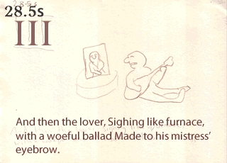
A model of the mistress (morphlike maiden) is photographed, printed and put in plasticine frame. The versatile wooden bench (eight legs, all different lengths) makes its first appearance.
Scene IV
More plasticine is brought in for cannon and hat feather. Subtle things like the cannon's lighting flame may be too subtle. Cotton wool for smoke and wire used for sword and feather spine.
Scene V
Maybe a seated model will not fall over? Here comes the bench again. Although justice's arms threatened to fall off. The "severe" eyes achieved by slicing off the top of the ovals. I couldn't find a way of working in the capon, which is implied (inside).
Scene VI
This lengthy scene was a bit of a challenge, with not a lot of action in the text, but I think it turned out alright, and is my favourite scene. The sword becomes a walking stick, the inevitable plunge groundwards (halted by the trusty bench) worked in as sign of infirmity.
Scene VII
The final scene shows some of the accumulated objects from the character's life as he lies on his deathbed (the pillow is fired Sculpey clay).
Reversing the original zoom, the camera moves out as the curtain closes and the lights are turned off, one by one, leaving us in the darkened theatre where we started.
Editing
The animation was exported from iStopMotion, and the audio from Garageband, and combined in iMovie for video editing. Titles and a short animation (Sleeping Dog) ident were added. The synchronization of speech with action worked surprisingly well (for example in Scene VI).
After some encouragement from litter-mates, 2013 was designated "Year of Animation".
A workshop/animation studio was carved out somewhere between the library and the beer cellar of the Beagle's Lair, after bulldozing out the accumulations of years of missed spring-cleaning opportunities.
Some budget-conscious selections from Ikea furnished and equipped the studio with:
a trestle table for supporting the sets during shooting, as well as providing some workspace;
three bendy, clampable LED lights;
a laptop table;
a comfortable wheeled, swivel armchair (bearing in mind one is sitting for long periods during this kind of animation, and switching from computer to camera to set).
I already had:
a laptop computer;
a copy of Boinx iStopMotion 2 (Home edition) software;
a camera tripod;
For the workshop area, where sets and models would be built, I got a Draper steel workbench from Amazon. Oh, if it were only that simple: the tale of having to pick it up from an industrial estate depot, wheel it to the bus stop, wait for a bus with appropriate access, get it back to the Lair, assemble/disassemble/reassemble it correctly with a rubber mallet; that is a tale of fortitude and triumph and backpain that will not be dwelt upon. However, it is a very nice workbench, with two drawers that I started filling with various tools and glues.
I also got a couple of matching storage containers for all the smaller resources, from nails and screws to thread and wax and beads and so forth that were to play their parts.
After consulting with a photographer friend, I decided to get an entry-level digital single-lens-reflex camera, a Canon EOS 1100D, to be used for the main still photography. I also got a Sony Handycam CX190 for video work and other snaps, which was useful for some research.
For recording audio, particularly narration, I went for a Blue Microphones Yeti USB microphone, and I later got a pop filter (Sleeping Dog's spittle and speech impediments need all the disguising they can get). The audio is recorded in Apple's GarageBand software.